This Project was done for KT Pacer. I worked with the ADI group to create a merchandise store for employees and customers of KT Pacer that will sell KT Pacer apparel and promo items. My job was to design the layout of the store, write the information displayed throughout the site and create graphics to use for banners and mockups.
Graphics
Graphics used throughout the store's homepage to create illustrations of the KT Pacer apparel that appeal to the customer.
1/4
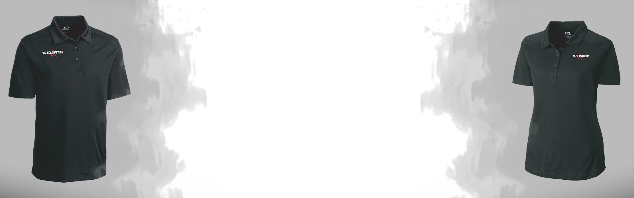
This section was designed to use as a full-width banner after the Callout Boxes (as shown below in the wireframe). Its intent is to compare men's and women's KT Pacer apparel so the customer may see the variation
2/4
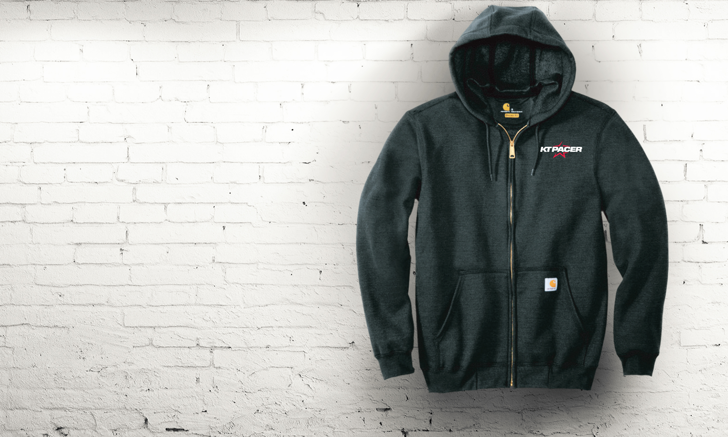
Mockups created for the callout boxes. The intension was to illustrate a real-life application of the product
3/4
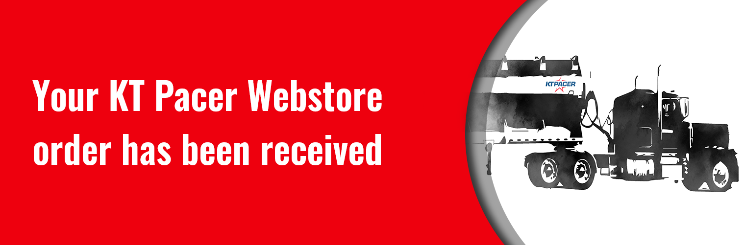
Email notifications designed around an illustration I created, modeled after a real KT Pacer feed trailer. This email notification gets sent to a customer once they have ordered, shipped, canceled, etc. KT Pacer's colors are red and blue so I used red to draw the customer's attention to the important notification.
4/4
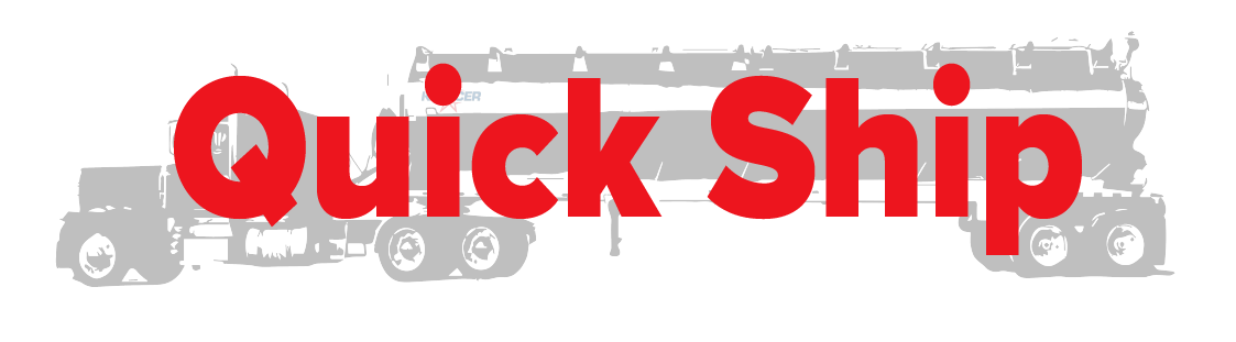
Quick Ship label placed in the corner of a product. A product or apparel item will show this label if it is in stock and available to order with a 2-day shipping time. I used the same illustration of the KT Pacer feed trailer, but a "bleeding through" look.
Banners
Banner creating for their marketing website where employees and customers go to purchase KT Pacer merchandising. Images used were taken and created by Ashley McDowell for the background.
1/3
First banner slide with "Welcome" text, as shown below in the wireframe. I wanted a dark photo to allow visiters to see the white text clearly, but with texture added to enhance the visual of the photo.
2/3
Second banner contained the same style as the first, but will contain more wording.

3/3
The final banner is designed with an aluminum background to represent KT Pacers feed trailers, which are made out of aluminum. The white outline displays a cutout look to convey depth. This banner has a simplistic approach because its purpose will be to portray important information for the customer.
Wireframe
Wireframe & Guide
The content below includes a wireframe of the apparel store home page and the guide to go with the wireframe. The guide is to help the ADI developers by including as much information and detail as possible. It contained the color palette, fonts used, pictures and info descriptions. The empty section in the wireframe is there to direct the developer as to where the product category was to be shown.
Wireframe Layout
Wireframe Guide